Tuesday 28 February 2012

Theory and Practice - Screen space

Task
Off Screen Space:  Find some examples of off screen space found in film, animation and computer software programs/ interfaces.

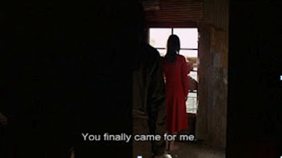
Kiyoshi Kurosawa's Retribution-2006
Windows or open doors—between on-screen space and off-screen space are an important motif in Kiyoshi Kurosawa’s films.


Tango (1981) - Director: Zbigniew Rybczynski
Rybczynski makes critical use of off-screen space, exposing it for the artifice it is. Off-screen space is the imaginary area beyond the edge of the screen, and in front of or behind the camera. There are a number of ways through to off-screen space in Tango – a window and a door in the back wall, doors on either side of the room, and cupboard which also has its uses.


Off screen tabs
Like when you open Safari and see "Top Sites," Chrome would be able to load pages inside of pages with an experimental "off screen tabs" feature.


Theory and Practice -Metaphor

Task 1

Find examples of visual metaphors used in film, computers and everyday life for the following:
The passage of time
Controlling movement
Tools in software programmes

The Curious Case of Benjamin Button is based on the short story by F. Scott Fitzgerald and was adapted to film by director David Fincher.
The film starts with a parable about a clockmaker who builds a clock that runs backwards, as a symbolic attempt to bring home the son he lost in the First World War. The clock reappears several times in the film as a metaphor for Benjamin's own life. The physical clock was never built for set.


The evil eye is a metaphor of protection and brings luck to all.

With its warm blue, the shine it has derived from the fire and the smiling face that's a typical feature of the Anatolian people, it gives happiness to the friends and the beloved ones.
The Reflections of an Ancient Anatolian Belief on Glass: Nazar Boncugu Throughout the whole human history, in every culture and religion, the eye figure has been considered as a powerful talisman to defy evil forces.
Belief in the evil eye, is strongest in the Middle East, South Asia and Europe, especially the Mediterranean region; it has also spread to other areas, including northern Europe, particularly in the Celtic regions, and the Americas, where it was brought by European colonists and Middle Eastern immigrants.


Brain-As-Computer Metaphor

According to author of Mind Performance Hacks, and Dr. Jonathan Sullivan MD PhD in neurology, to consider the brain is a computer, the mind is software. The software of thought is supposed to operate much like that of a computer, going from discrete state to discrete state.


Metaphor Tools in software programmes

The Windows interface metaphor is used by most operating systems. This sets expectations for users by setting conventions. Users become familiar with the conventions and are better able to use additional software.


Task 2

Discuss Theodor Holm Nelson’s criticisms of the the ‘desktop’ metaphor: describe briefly why you agree or disagree with his assertion:

“We are told to believe that this is a “metaphor” for a “desktop.”  But I personally have never seen a desktop where pointing at a lower piece of paper makes it jump to the top, or where placing a sheet of paper on top of a file folder causes the folder to gobble it up.  I don’t believe such desks exist; and I don’t think I want one if it did.”
Nelson, The Art of Human-Computer Interface Design, (1990: 237)


The whole idea of a desktop metaphor is that it is a metaphor not the real thing. The desktop metaphor is used to suggest that a computer screen is like a physical desk, with papers and folders to shuffle around and various desk accessories, such as calculators, printers, and notepads.
This above picture of the desktop of an individual who has given up organizing their files and folders, and instead relies completely on Spotlight to access their files. I’ve said in the past that I think the desktop metaphor is insufficient for managing the stuff we now store on our computing devices.

Task 3

Find examples of icons used in software of websites which you find unhelpful or confusing.

I’m new on Photoshop and flash so sometimes get confused with how to handle certain tasks, and determine the differences between the various pen symbols.
For example two tools (burn & dodge) on Photoshop is related to the film photography world, so if you’ve never been in a dark room, you might be a little confused.


Sunday 26 February 2012

Theory and Practice - Information Structures

Task 1
Find examples of modernist and contemporary architectural design based on the grid system.

The American Restaurant, Kansas City, 1974 by Warren Platner.


Macquarie Group - Project location: Sydney, Australia Dimensions: 35000 m2 Client: Brookfield Multiplex Developments Year: 2009
The design takes its concept from the diagonal grid on the external façades, rejecting the orthogonal grid of the neighbouring buildings. This is instantly identifiable regardless of where it is glimpsed. The diagonal grid acts as both the vertical and horizontal structure of the building.


 State of Illinois Building, Chicago, Illinois, USA

L'Institut du Monde Arabe, Paris, France


Designed in 1966 by Warren Platner, the replica Platner Side Table is steel wire sculpted vertically into a flowing design.


Task- 2

The designer Massimo Vignelli deploys the grid system in his graphic designs for printed materials.Find three examples of work by designers who also use the grid system.

In 1977, Massimo Vignelli designed the Unigrid System for the National Park Service. The module grid system sized at ISO A2 (16.5 × 23.4or 420mm × 594mm) allowed the NPS to created brochures in ten basic formats and to keep a consistent, recognizable structure across all its materials.


Josef Muller Brockmann Grid system


Max Bill


The work of Graphic Designer Jan Tschichold of the 1920s illustrates the opposite of these ideas as a reaction to the chaotic, disruptive, and violent nature of the Futurists. Tschichold set up a formulaic grid system for what he felt to be proper layout proportion


Task-3

Give two examples of the grid system in film editing and title sequences.

Kyle Cooper and David Fincher collaborated on the titles to The Dark Knight Rises. The new Batman movie that isn't out until summer 2012. This unofficial title sequence was created as part of a class assignment by a student of Communication Design from Istanbul, Turkey. His name is Doğan Can Gündoğdu.


Stranger than Fiction is a 2006 American film directed by Marc Forster written by Zach Helm and starring Will Ferrell, Maggie Gyllenhaal, Dustin Hoffman, Queen Latifah and Emma Thomson.


Task- 4
Give three examples of the Rule of Thirds in different visual forms.
This classic Rule of Thirds composition has all the restfulness of the locale. Chuck Daverio photographed with a Nikon D300 and a Tamron 28-300mm lens with an exposure of f/8 at 1⁄2000 sec at ISO 1600.


Sarah Szabo took the Rule of Thirds another step in this photo of her daughter by using a truncated oval and reflections that skewed the various forms, all while placing her daughter in the left third on the vertical plane. She photographed with a Sony
Cyber-shot DSC-H1 and an exposure of f/3.5


Darren Rowse


Agency model Jenni is illuminated with natural daylight filtering from a window at the U.S. Virgin Islands.By Rolando Gomez


Task - 5
Describe why the grid system can be successfully used in web design.
Using grids in web design makes the website look well-structured and balanced even if the pages are busy with many elements. If you are kind of person that looks for order in everything and the grid is such a  useful, functional way of finding or creating order in many, many design problems. 
Using grids is very much like alphabetizing things. Sooner or later, you realize that the alphabet is an incredibly useful organizing principle.
Using a grid gives you an immediate benefit in terms of your designs looking better and, crucially for interaction design, imparting a sense of order and more intuitive behaviour.
The true benefit of using a grid is that as you learn how to use a grid, you start to think systemically about the solutions you design. You start to try and see how various details can echo one another, how different regions of the canvas can be reused or used for similar things, how like elements can be grouped together.
Given the right grid the right system of constraints very good designers can create solutions that are both orderly and unexpected. That’s when you’ve gone from using the grid as a style and moved into using the grid as a real tool for creativity.
Also for the developer grids are useful and help maintaining the pages easier. Grid in web design is basically a style in which a website is divided into different grids i.e. vertical and horizontal lines so that you can position different design elements efficiently and effortlessly.
Grid opens the door to a higher level of design thinking.

Find examples of websites which are designed using a grid.

I have found some examples of websites that use some form of grid styled layout.


Wednesday 22 February 2012

Theory and Practice - Engagement


Task-1

Give your responses to these two questions, illustrated with visual material, in your sketchbook and blog.

·        In film, the audience is hooked within minutes, usually seconds...
How does film do this?

I think an effective good title sequence is a good way to grab the audience’s attention in the first few minutes.

Then one of most important engagement key for audience is good effective story;
Stories must have meaning coherence to entertain. That is, each event in the story must somehow stand in relation to other events in the story (a relationship bridge) and have some meaning to the character and audience.

Knowing the main character or favourite actors keeps our attention on the movie.

Audiences want to laugh, cry, vicariously experience a great ride, be adventurous, see spectacular things, see new things, get "jolted and shocked," have positive outcomes affirmed, see drama that challenges them and makes them think about their world, be inspired, and, in short, have some experience that temporarily displaces them from everyday life and changes their mood.

There is a strange but refreshing kind of tangibility that pulls the audience into the film and expresses the emotions of the characters. Soundtrack will also make engagement between audience and the movie.


·        When we visit a website or open new software it has to grab our attention..
How does the designer achieve this?

  •  The first thing is a good effective Homepage.
The homepage tells visitors who you are and what they can expect to find in your site which basically is the front door of the website. The purpose of the homepage is to give an overview of what visitors can expect to find in web site. Therefore it needs to be strong, make a statement and grab the attention. If it doesn't grab their attention, they will hit the back button.

  •          Meaningful Headline
If the opening statement is strong and meaningful, the visitors will want to explore further. Only one good sentence gives you a general overview of what the product is and its benefit.

  •          Strong images and Graphics
Using images that are related to its service, or a meaningful metaphor. Photography isn't always necessary on the homepage, sometimes nice illustrations, interesting text treatments or just a good design is all need. The key is to make it interesting and meaningful.

  •          Appropriate and Attractive Colour Scheme
Colours capture the viewers’ attention, especially if they are used in an appropriate manner. If your expected viewers are children, the best colours you can use are the bright ones but make it pleasing to the eyes. If you are designing for a company, then you should choose colours that can give a professional look.

  •          Clean, Organized Layout
A well-organized layout not only looks better, it's more comfortable for the viewer.

  •          Simplicity
Visitors don't spend long on the homepage; they go there to see where to go next. Therefore regardless of how large your site is the homepage needs to be simple. Using good headlines, short blurbs, and relevant images to help guide visitors around the site.

  •          Speed
The home page and other pages must be fast in loading. Or else, your viewers will get disappointed on your site.


Task-2

Give two examples of outstanding opening sequences from films, and describe how the directors; Orientates the audience / Establish key information. 

The Shining 1980 (Stanley Kubrick)


The opening sequence in The Shining starts off by us flying through a massive lake, we are then sent up in the air to get a bird’s eye view of a small car travelling through a snake like road. This is to show us how grand and vast America is. A non-diegetic soundtrack is running in the background, which sounds like an electronic keyboard, in low key.  This gives the scene a menacing feel to it, as if something is approaching.
We move to a bird’s eye shot via a cut, which also follows the car, and we see that the car is in a very remote area, where there are mountains in the background.  This long take lasts about 17 seconds, which calms the audience.  Via a jump cut, we go to another shot where the car is on a different part in its journey.  During this part of the opening sequence, the opening credits start to roll up and show the producer, the name of the film, the stars, and other people involved in the film.
The colour of the font is blue which is usually seen to be a more gentle colour but Kubrick makes this font seem more eerie by the sound he uses of tribal music and screaming women. And perhaps to emphasize all the more the claustrophobic/no way out of what is to come.
After two and a half minutes of the opening scene and credits we are introduced to the overlook hotel for the first time, we know nothing about it but what it looks like and how big it is. We assume this is where the story is going to take place straight away.

The Taking of Pelham 123 Directed by Tony Scott – 2009

Loud music, fancy title effects swishing back and forth, in and out of frame, intercutting with images of people on the subway.

The opening sequence of this movie seems to be directly connected to trains (perhaps to establish the sub-genre of the film right from the beginning) for example, loud music used at the very beginning sounds like a train, and even the production/distribution company is filmed as if it's a train getting closer to the screen.

I thought it was an effective title sequence because of the range of shots used which conveyed the genre, and I liked the use of editing as it established the plot of the film well.

I also liked  the fancy title effects swishing back and forth, in and out of frame, intercutting with images of people on the subway.

I particularly like the way the cast/director/producer etc, names appear and disappear on the screen throughout the opening sequence with a thick black line (as if the names are passengers and the line is a train collecting or dropping them off) Editing is the main technique used in this sequence to grab the audience's attention and establish the recurring theme of trains and sub-genre (action thriller)


Task-3

Based your experienced of RPG's(role-playing games),give three examples of narrative structures.

Robot Chicken


Robot Chicken defies traditional narrative structure, and thus this RPG will defy traditional gaming structure. Most roleplaying games tend to fall into two categories: miniatures-esque games about killing things, and story games about angsty character development. A Robot Chicken RPG wouldn't be too concerned about either of those ideas, it would be about short scenes involving insane situations and unexpected perversions of our beloved childhood memories.

L.A. Noire


Developed by Team Bondi, L.A. Noire is an interactive detective story set in the classic noir period of the late 1940s. L.A. Noire blends action, detection and complex storytelling and draws players into an open-ended challenge to solve a series of gruesome murders.


Call of Cthulhu


Originally a story by H. P. Lovecraft, his brand of horror was turned into a role-playing game by Chaosium many, many years ago, when Dungeons & Dragons became very popular.

Call of Cthulhu has a reputation as a game in which it is quite common for a player character to die in gruesome circumstances or end up in a mental institution. Unlike in most other role-playing games, eventual triumph of the players is not assumed.

One of the main statistics in this game is "Insanity Points." As the character see aliens, undead creatures, elder gods and even cast magic spells, they slowly lose their sanity. In other words, everyone eventually goes insane at some point.


Describe how these structures differ from conventional film narrative.

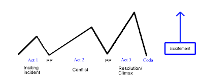
Conventional film narrative is normally based upon the Three Act Structure, which is intended to fill 90+ minutes, and end in a resolution. Conventions of narrative form,
Such as unity, clarity, sympathetic, action-oriented characters, closure,
And unobtrusive craftsmanship as you can see below two images showing differences between role-playing narrative structure and conventional film narrative structure.


Task -4

·        Investigate Julian Jackson’s article on RPG’s and Film Narrative:

·        Give an example of cause and effect in RPG


Since 1979, role-playing games such as Dungeons & Dragons have drawn criticism from those who feel that they promote witchcraft, Satanism, and the occult, and encourage youths to perform acts of suicide and murder; more recently, collectible card games have been criticized in a less severe manner. The fact is that RPGs and CCGs are simply games, and they can be used to educate as well as entertain. In considering this topic, two sources of primary data were consulted; a survey of long-time players of RPGs and CCGs, and an interview with a grade school teacher who uses both types of games in the classroom. Secondary sources that were consulted included an observation of children playing D&D in an after-school program, a psychological profile of gamers conducted in 1987, and many others. Despite the attacks they have received, it is clear that RPGs and CCGs are a harmless and occasionally beneficial mode of entertainment that has been misrepresented in the past.


Task-5

Give example of social interaction and collaboration in RPG’s and LARP’s
Or MMORPG’s.

The social interactions of participants in virtual worlds are often viewed in the context of 3D Games; other forms of interaction are common as well, including forums, blogs, wikis, chat rooms, instant messaging, and video-conferences. Communities are born in places which have their own rules, topics, jokes, and even language. Members of such communities can find like-minded people to interact with, whether this is, through a shared passion, the wish to share information, or a desire to meet new people and experience new things. Users may develop personalities within the community adapted to the particular world they are interacting with, which can impact the way they think and act. Internet friendships and participation in online communities tend to complement existing friendships and civic participation rather than replacing or diminishing such interactions.

MMORPGs almost always have tools to facilitate communication between players.
In addition, most MMOs require some degree of teamwork for parts of the game. These tasks usually require players to take on roles in the group, such as those protecting other players from damage (called tanking), "healing" damage done to other players or damaging enemies. Community resources such as forums and guides exist in support of this play style.
For example, if a player wants to play a priest role in his MMORPG world, he might buy a book from a shop and learn priestly skills, proceeding to speak, act, and interact with others as their character would.


Task -6

Find examples of special and temporal reference in films, games, web design, software and apps.


Language Lens


The site has a clear and specific historical purpose, but also serves to offer great language-learning opportunities as students need to process many directions and solve problems, navigating the palace and dealing with spatial and temporal concepts.  


Saturday 7 January 2012

interactivity

1)    The history of human and computer interactivity
Until the late 1970s, the only humans who interacted with computers were information technology professionals and dedicated hobbyists.
Interaction between users and computers occurs at the user interface (or simply interface), which includes both software and hardware; for example, characters or objects displayed by software on a personal computer's monitor, input received from users via hardware peripherals such as keyboards and mouses and other user interactions with large-scale computerised systems such as aircraft and power plants.

How these devices affect the type of human computer interaction
Human beings interact with computer systems largely through input and output...In computing, input/output, or I/O, refers to the communication between an information processing system (such as a computer), and the outside world, possibly a human, or another information processing system. Inputs are the signals or data received by the system, and outputs are the signals or data sent from it.
The term can also be used as part of an action; to "perform I/O" is to perform an input or output operation. I/O devices are used by a person (or other system) to communicate with a computer. For instance, a keyboard or a mouse may be an input device for a computer, while monitors and printers are considered output devices for a computer. Devices for communication between computers, such as modems and network cards, typically serve for both input and output.
2) Simulation
·         There is a computer model of a real or theoretical system that contains information on how the system behaves.
·         2. Experimentation can take place, i.e. changing the input to the model affects the output.
Describe the kind of interactive experiences involved with computer simulation such as driving style games
Simulation game attempts to replicate various activities in "real life" in the form of a game for various purposes: training, analysis, or prediction. Usually there are no strictly defined goals in the game, just running around, playing as a character. Well-known examples are war games, business games, and role play simulation. On one hand the game has a very heavy simulation feel with it’s more realistic submarine driving controls.
3) Hypertext
A special type of database system, invented by Ted Nelson in the 1960s, in which objects (text, pictures, music, programs, and so on) can be creatively linked to each other. When you select an object, you can see all the other objects that are linked to it. You can move from one object to another even though they might have very different forms.
The type of interactivity involved with hypertext
The implicit invitations called hypertext that link you to other pages provide the most common form of interactivity when using the Web (which can be thought of as a giant, interconnected application program)
In addition to hypertext, the Web (and many non-Web applications in any computer system) offers other possibilities for interactivity. Any kind of user input, including typing commands or clicking the mouse, is a form of input. Displayed images and text, printouts, motion video sequences, and sounds are output forms of interactivity.
4) Games
Computer Games

The level of interaction needed to play a computer Game
Hand/eye Coordination, ability to remain calm and thinking at a fast pace. You need good reflexes, a cool head to think about your next move, and you really need to have good concentration.
5) Virtual Reality
The user must then be able to interact with the environment in a natural, intuitive manner. Various immersive technologies such as gestural controls, motion tracking, and computer vision respond to the user's actions and movements. Brain control interfaces respond to the user's brainwave activity.

6) Time based
Examples of time based work
YouTube is one of the biggest web sites that you can find and watch time based work.

Types of Interaction;
External controls, tooltips,scrolling and zooming, mark-driven events and coordinate-driven events.
7) Task Orientated software
Task-oriented software is the most widely used because of its capability in reducing our work. Productivity software’s or task-oriented-software’s can make our work faster, whether at home or in business, and our lives easier. These software’s help us in doing our day-to-day tasks and activities thereby lessening the manual work needed to finish those tasks. The major categories of these task-oriented software’s are word processing/publishing, electronic spread sheets, database management, graphics and communication. Office Suites are just a mix of different attributes found in the said categories.