Task 1
Find examples of modernist and contemporary architectural design based on the grid system.

Macquarie Group - Project location: Sydney, Australia Dimensions: 35000 m2 Client: Brookfield Multiplex Developments Year: 2009
The design takes its concept from the diagonal grid on the external façades, rejecting the orthogonal grid of the neighbouring buildings. This is instantly identifiable regardless of where it is glimpsed. The diagonal grid acts as both the vertical and horizontal structure of the building.


State of Illinois Building, Chicago, Illinois, USA

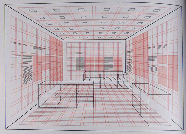
L'Institut du Monde Arabe, Paris, France

Designed in 1966 by Warren Platner, the replica Platner Side Table is steel wire sculpted vertically into a flowing design.

Task- 2
The designer Massimo Vignelli deploys the grid system in his graphic designs for printed materials.Find three examples of work by designers who also use the grid system.
In 1977, Massimo Vignelli designed the Unigrid System for the National Park Service. The module grid system sized at ISO A2 (16.5″ × 23.4″or 420mm × 594mm) allowed the NPS to created brochures in ten basic formats and to keep a consistent, recognizable structure across all its materials.


Task-3
Give two examples of the grid system in film editing and title sequences.


Find examples of websites which are designed using a grid.
I have found some examples of websites that use some form of grid styled layout.


Josef Muller Brockmann Grid system
Max Bill

The work of Graphic Designer Jan Tschichold of the 1920s illustrates the opposite of these ideas as a reaction to the chaotic, disruptive, and violent nature of the Futurists. Tschichold set up a formulaic grid system for what he felt to be proper layout proportion

Task-3
Give two examples of the grid system in film editing and title sequences.
Kyle Cooper and David Fincher collaborated on the titles to The Dark Knight Rises. The new Batman movie that isn't out until summer 2012. This unofficial title sequence was created as part of a class assignment by a student of Communication Design from Istanbul, Turkey. His name is Doğan Can Gündoğdu.

Stranger than Fiction is a 2006 American film directed by Marc Forster written by Zach Helm and starring Will Ferrell, Maggie Gyllenhaal, Dustin Hoffman, Queen Latifah and Emma Thomson.

Task- 4
Give three examples of the Rule of Thirds in different visual forms.
This classic Rule of Thirds composition has all the restfulness of the locale. Chuck Daverio photographed with a Nikon D300 and a Tamron 28-300mm lens with an exposure of f/8 at 1⁄2000 sec at ISO 1600.

Sarah Szabo took the Rule of Thirds another step in this photo of her daughter by using a truncated oval and reflections that skewed the various forms, all while placing her daughter in the left third on the vertical plane. She photographed with a Sony
Cyber-shot DSC-H1 and an exposure of f/3.5
Cyber-shot DSC-H1 and an exposure of f/3.5

Darren Rowse

Agency model Jenni is illuminated with natural daylight filtering from a window at the U.S. Virgin Islands.By Rolando Gomez

http://www.lensdiaries.com/photo-diaries/previsualization-and-passion-driving-forces-in-photography/
Task - 5
Describe why the grid system can be successfully used in web design.
Using grids in web design makes the website look well-structured and balanced even if the pages are busy with many elements. If you are kind of person that looks for order in everything and the grid is such a useful, functional way of finding or creating order in many, many design problems.
Using grids is very much like alphabetizing things. Sooner or later, you realize that the alphabet is an incredibly useful organizing principle.
Using a grid gives you an immediate benefit in terms of your designs looking better and, crucially for interaction design, imparting a sense of order and more intuitive behaviour.
The true benefit of using a grid is that as you learn how to use a grid, you start to think systemically about the solutions you design. You start to try and see how various details can echo one another, how different regions of the canvas can be reused or used for similar things, how like elements can be grouped together.
Given the right grid the right system of constraints very good designers can create solutions that are both orderly and unexpected. That’s when you’ve gone from using the grid as a style and moved into using the grid as a real tool for creativity.
Also for the developer grids are useful and help maintaining the pages easier. Grid in web design is basically a style in which a website is divided into different grids i.e. vertical and horizontal lines so that you can position different design elements efficiently and effortlessly.
Grid opens the door to a higher level of design thinking.
I have found some examples of websites that use some form of grid styled layout.


No comments:
Post a Comment